
This blog post will be talking about infographics. Infographics are a great way to relay information in an easily digestible and easily distributable way. They are a visual image that is used to show information. How does this relate to music in the pacific northwest?
With all of the streaming platforms available nowadays, it may be hard to choose which one you should release your music on. You may want to consider what your primary audience uses, how much money it costs, how much money you get in return, if you can sell merchandise, if you can announce tour dates, and if you would like to interact with your fans or not.
Back in the olden days, people would listen to music through record players, which then turned to cassettes, then CD’s, and now streaming. Prior to the 2010’s, radio, CD’s, MTV, and YouTube were the go-to’s to listen to music. In the 2000’s-2010’s, Pandora, YouTube, Bandcamp, and IHeart radio were some of the most popular streaming platforms. However, nowadays, Spotify, Apple Music, Amazon music, Soundcloud, and Tidal reign supreme. Music listeners are now plugging their phones into their car’s aux to listen to music streaming platforms rather than turning on their radio or putting in a CD.
With all of these platforms and methods of sharing music, it may be hard to compare and contrast all of the choices. If you are a band, musician, or PR professional in the music industry, infographics can be your best friend.
Take a look at this infographic on Virpp.com from 2023.
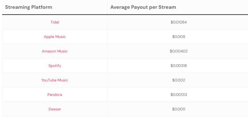
This infographic shows you the payout from each streaming platform. In a quick glance, you can see that Tidal pays out the most while Deezer pays out the least.
Now take a look at this infographic on CNN.com from 2024.

From this you can see that Tidal and Apple Music have the largest library size (quantity) and the most supported audio formats. Tidal has the highest bitrates (quality). However, it seems that YouTube music has increased their payout from $0.002 to $0.01009 in the last year, making them the highest payout in 2024.
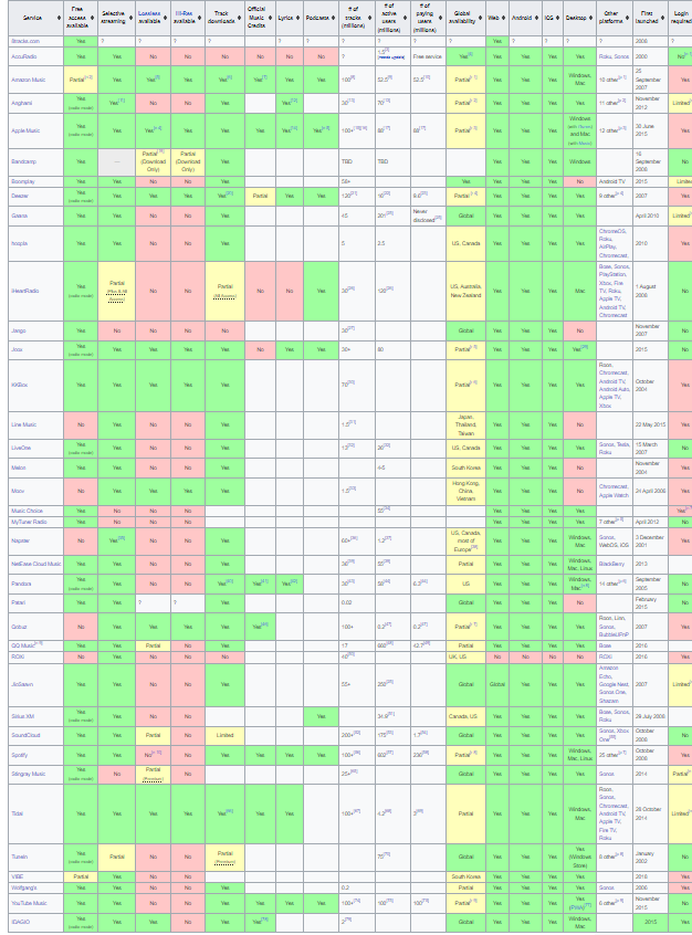
I also found this infographic on Wikipedia.com very informative as it shows more categories you may need to know, like if high res is available, if streamers can download the music, if they include lyrics, if it is available globally, number of active users, and if it is available for users on web, android, IOS, and desktop.
(Click the image to visit the page if you cannot see it clearly)
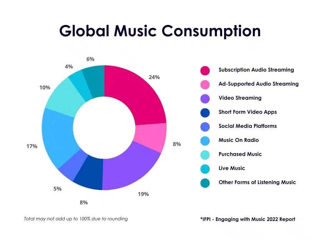
Wondering if it would be more beneficial to play your music live, on the radio, or on social media? This chart on digitalvirgo.com from 2022 shows the way that music is consumed globally. It reflects that subscription audio streaming is the most popular form with live music being the least.
Overall, the infographics have shown that streaming platforms are very beneficial for sharing your music with your audience, and it pains me to say as a die-hard Spotify fan, that Tidal, Apple Music, and YouTube Music may be the best platforms to share on. However, it also depends on what your audience generally uses to stream and if you care about earnings.
I was able to absorb a lot more information quicker and easier with these infographics, and I hope you were too. If you are in the music industry, I hope I was able to show you how you can utilize infographics in not only making decisions such as finding the right streaming platform, but other ways to help further your own brand.
PNW music recommendation of the week:

Leave a comment